Loading Stories...


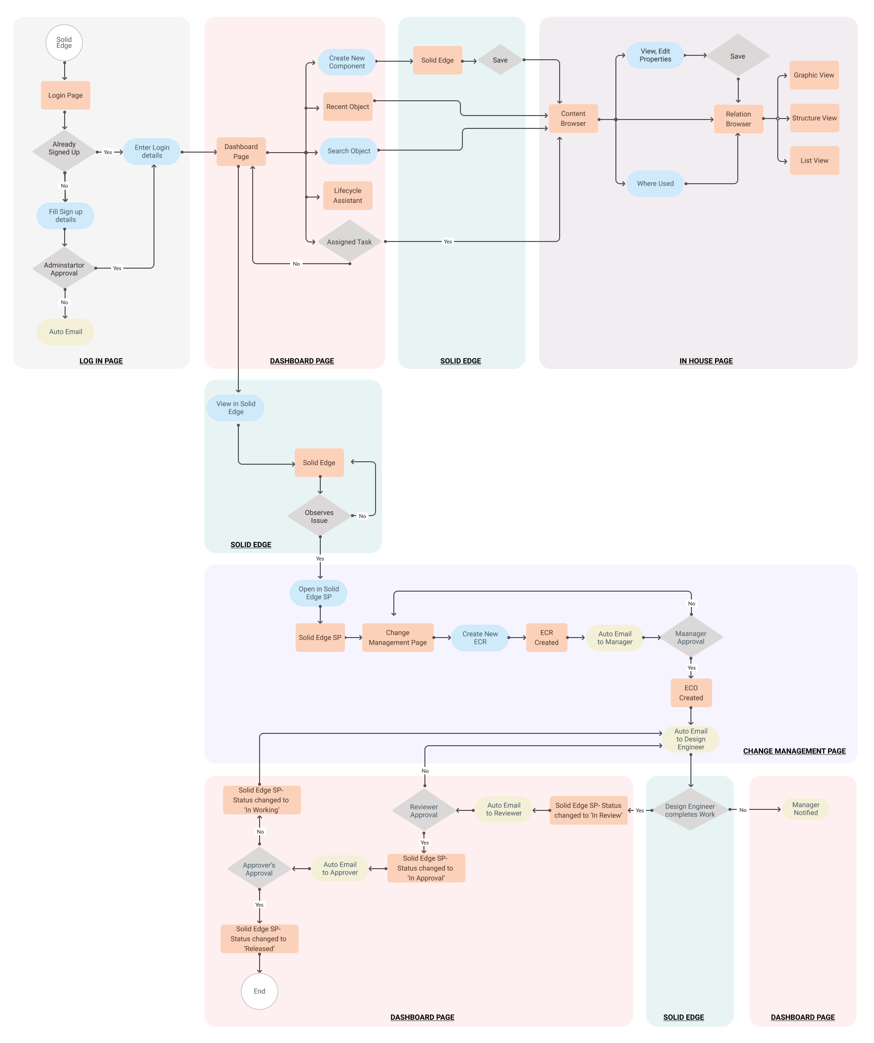

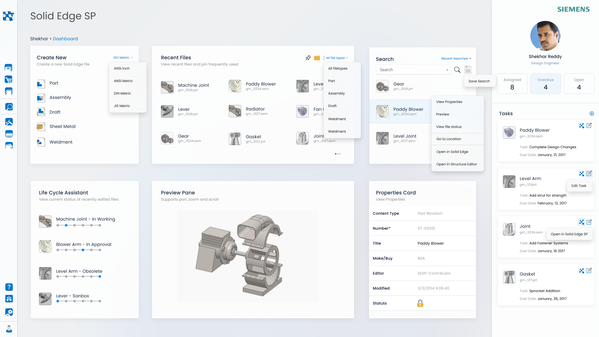
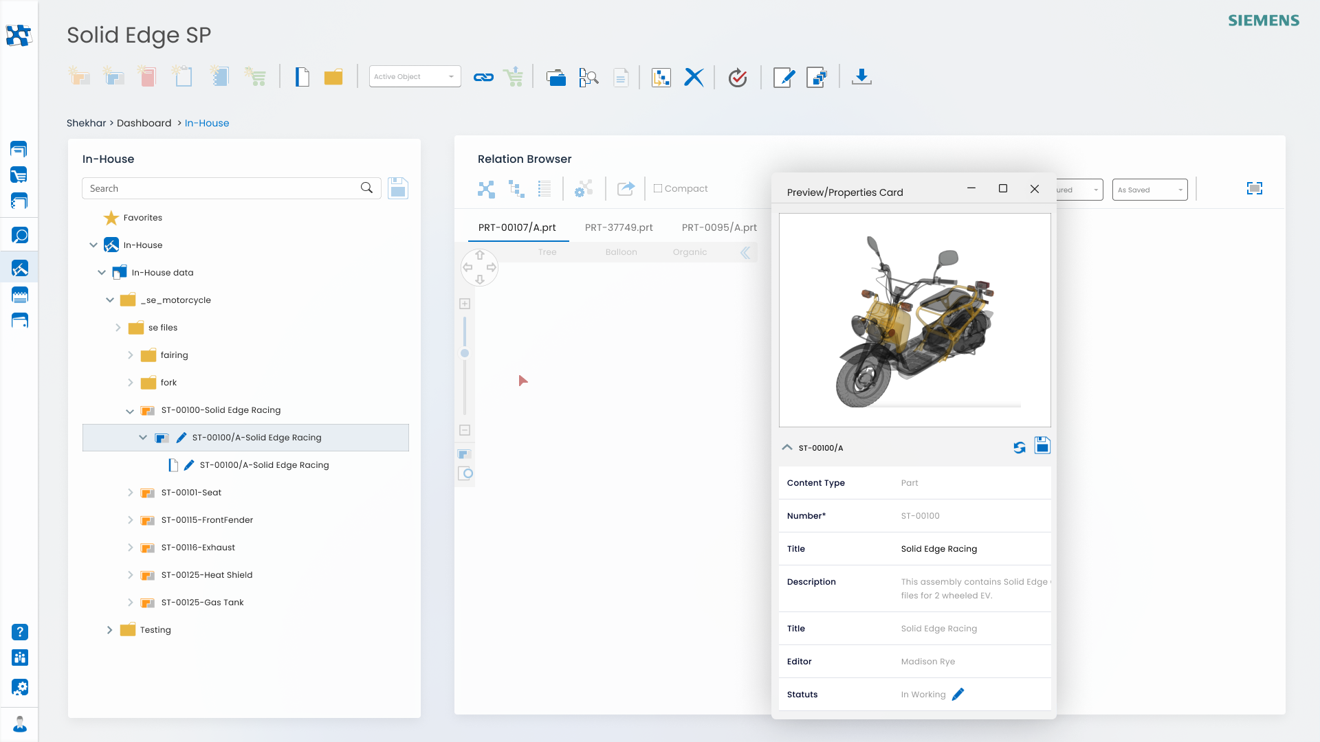
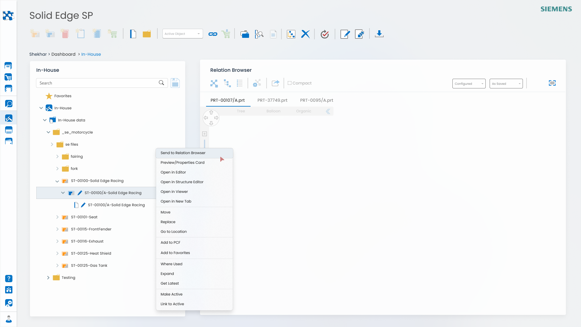
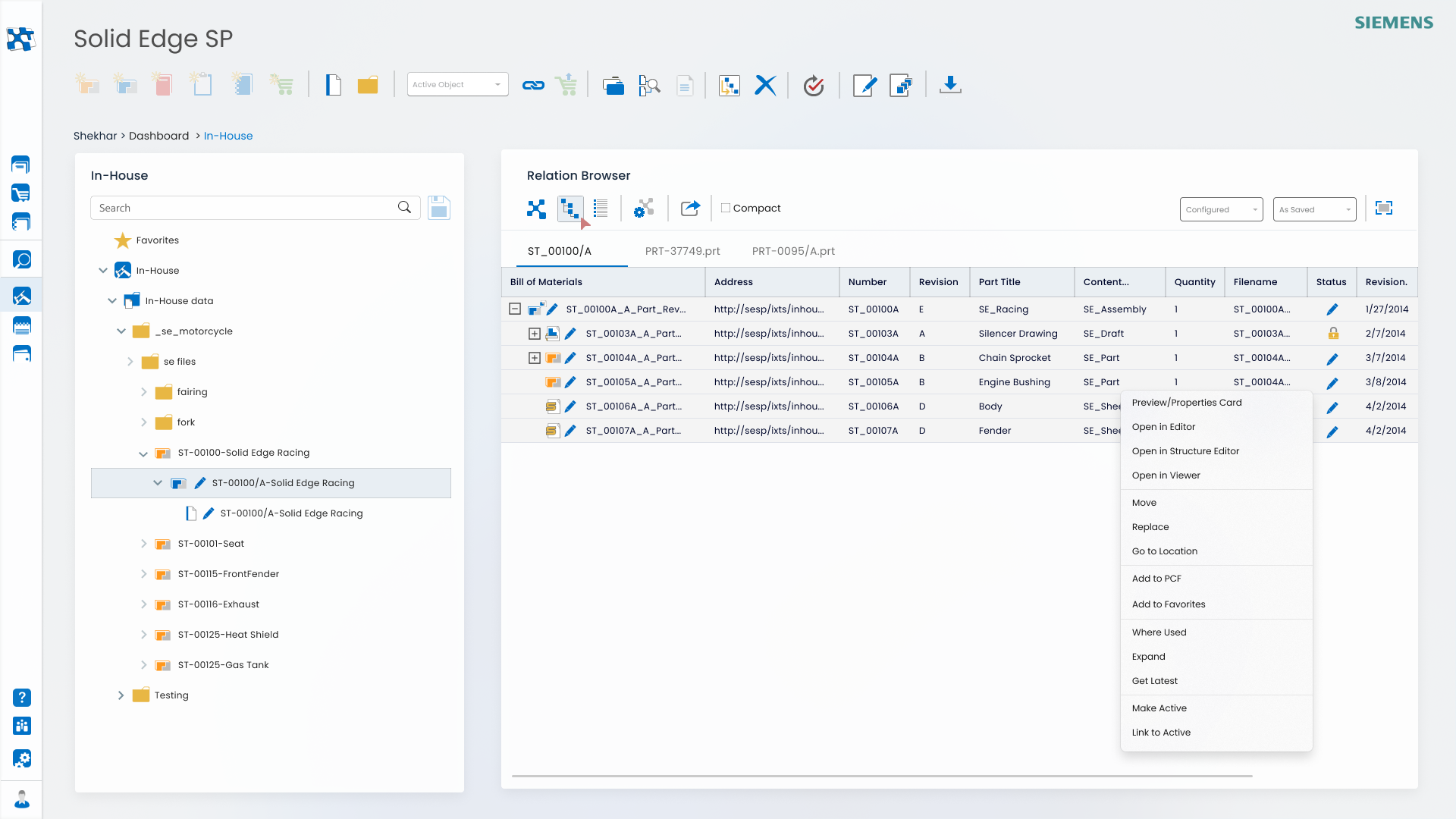
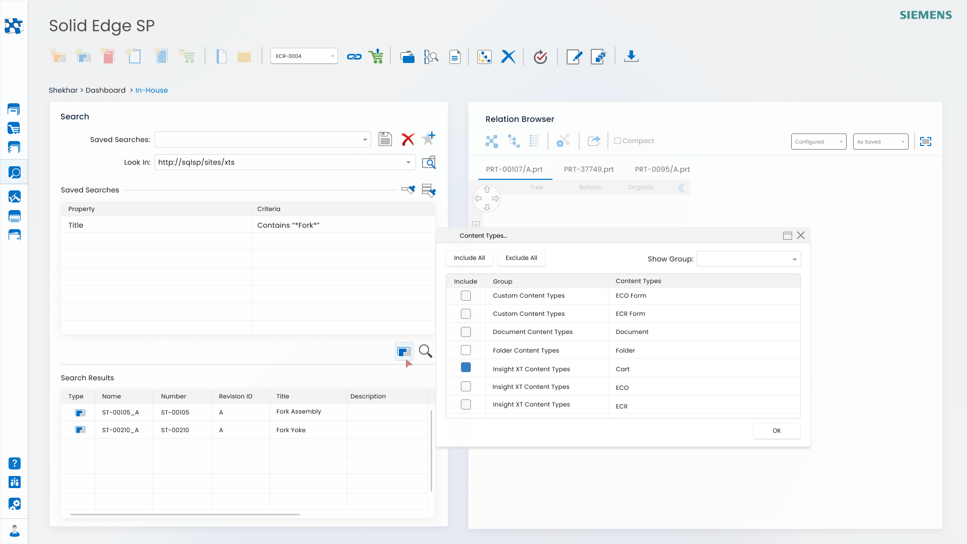
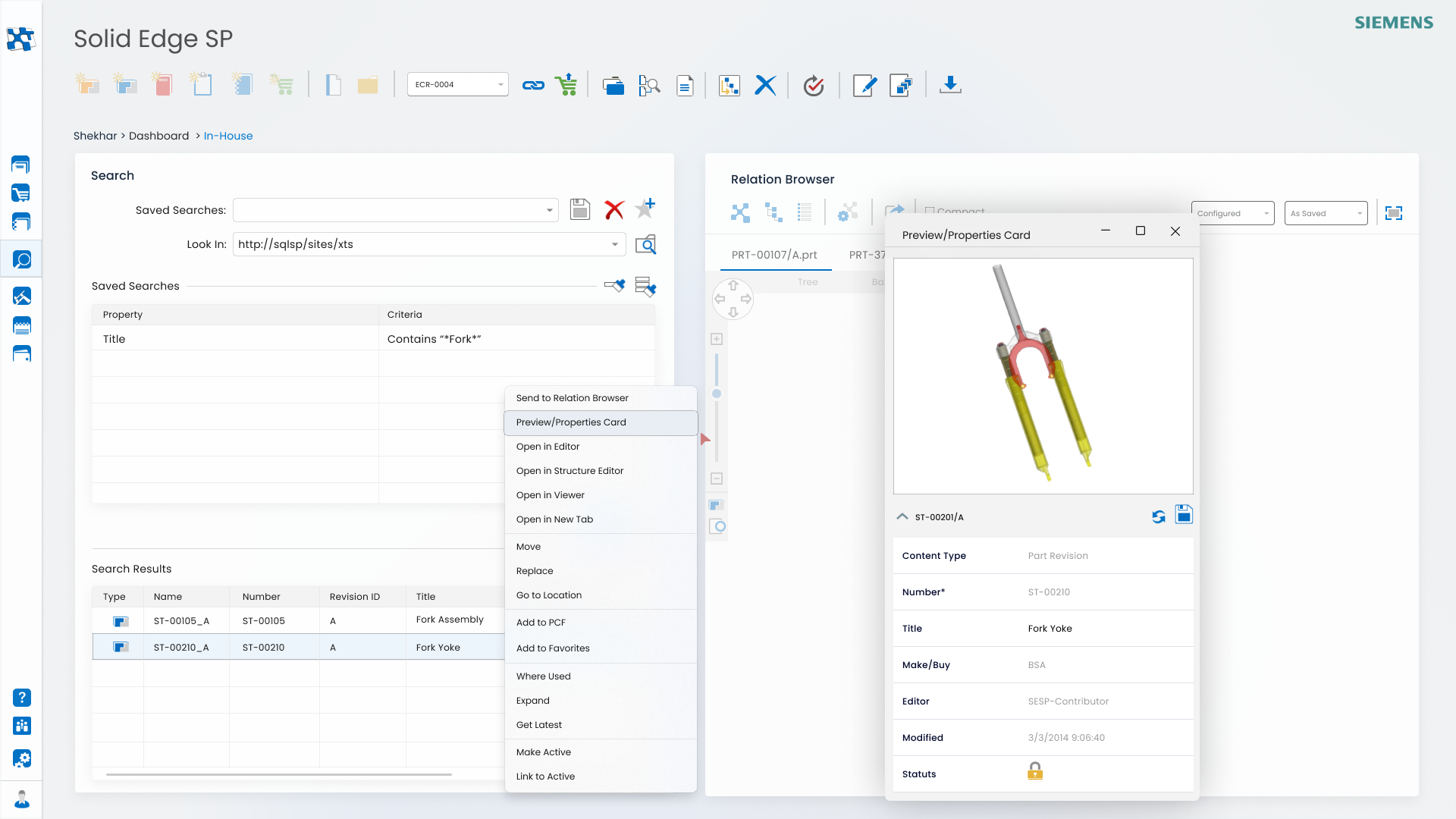
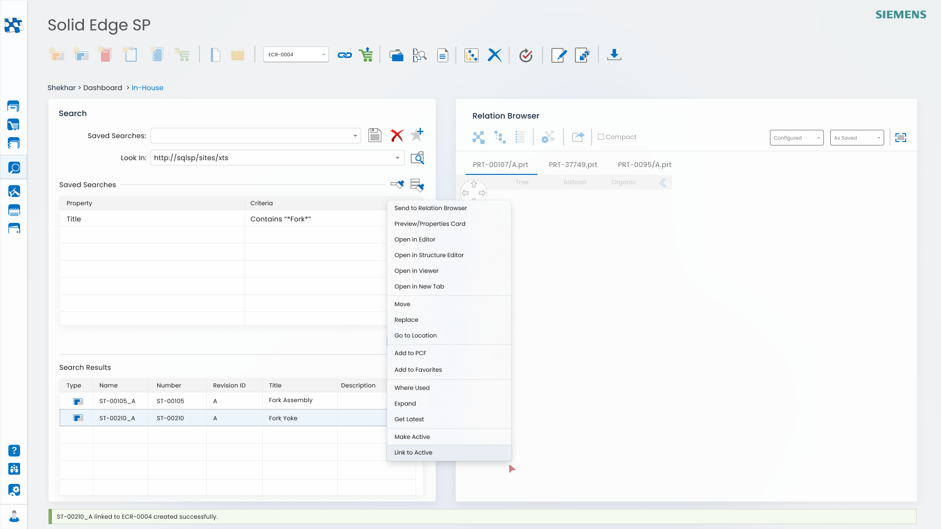
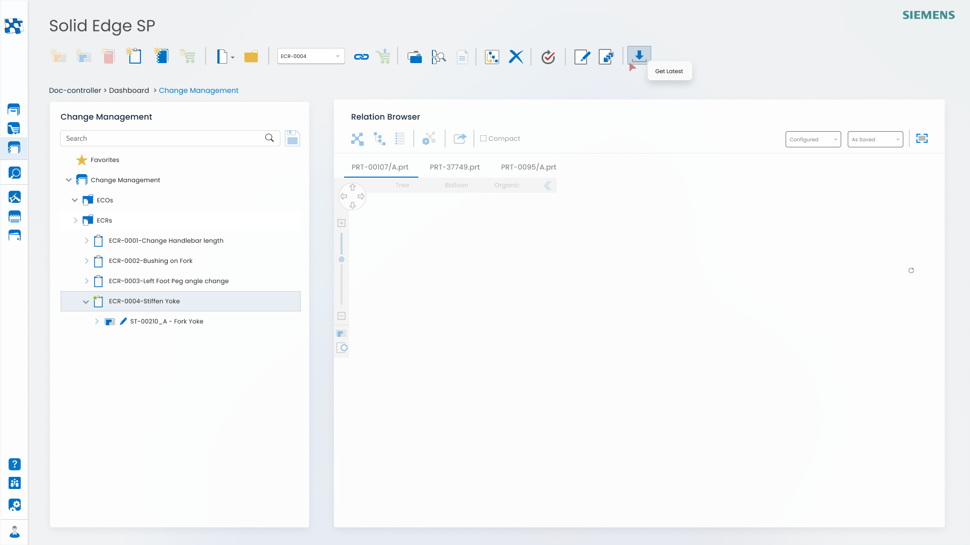
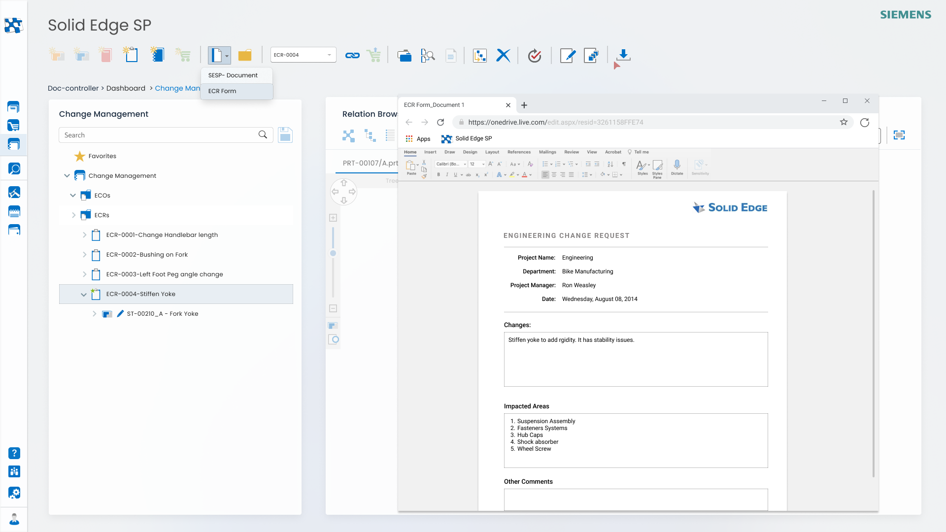
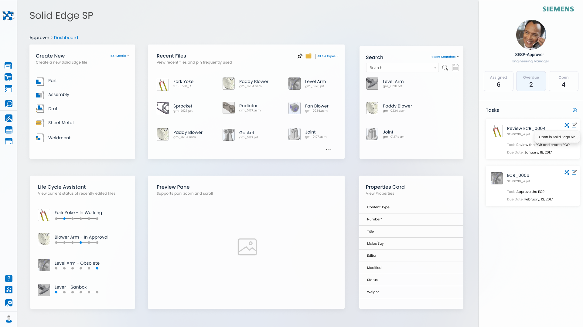
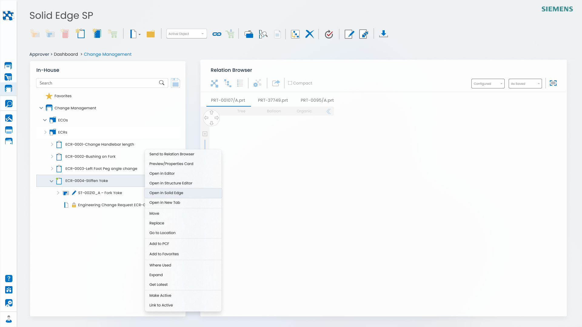
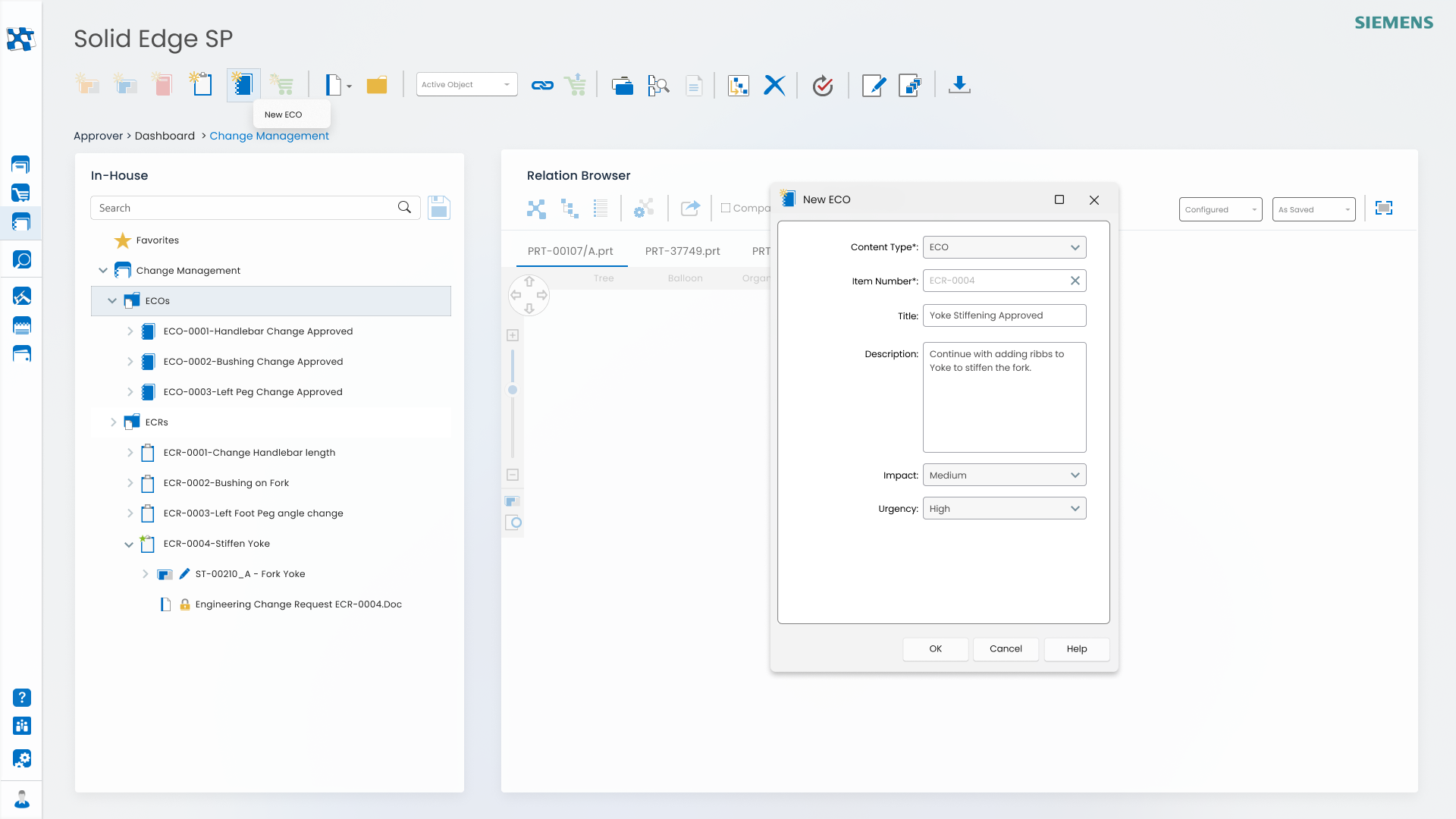
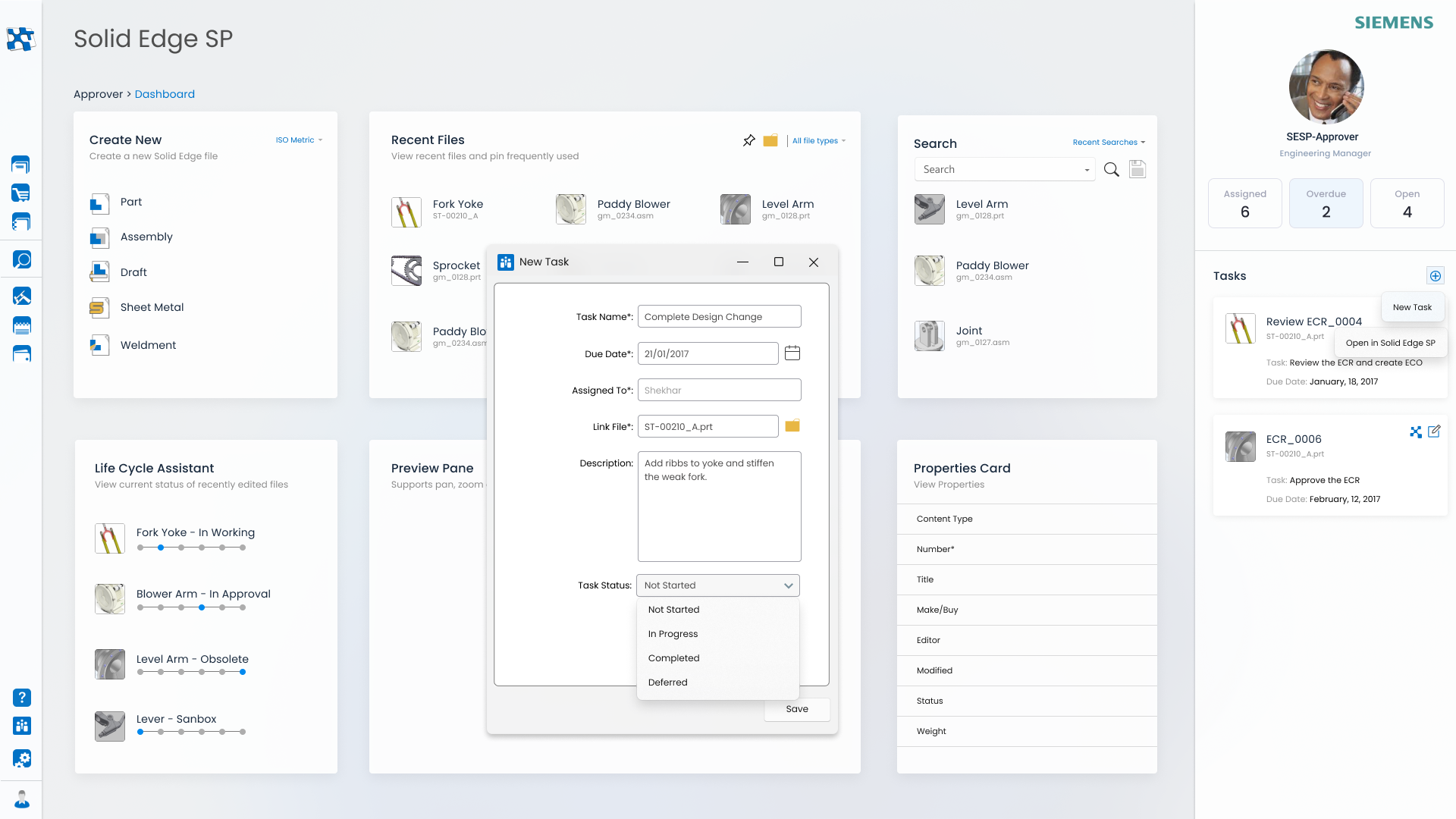
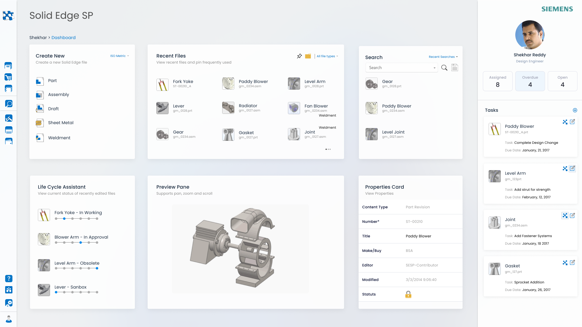
Command Functionality
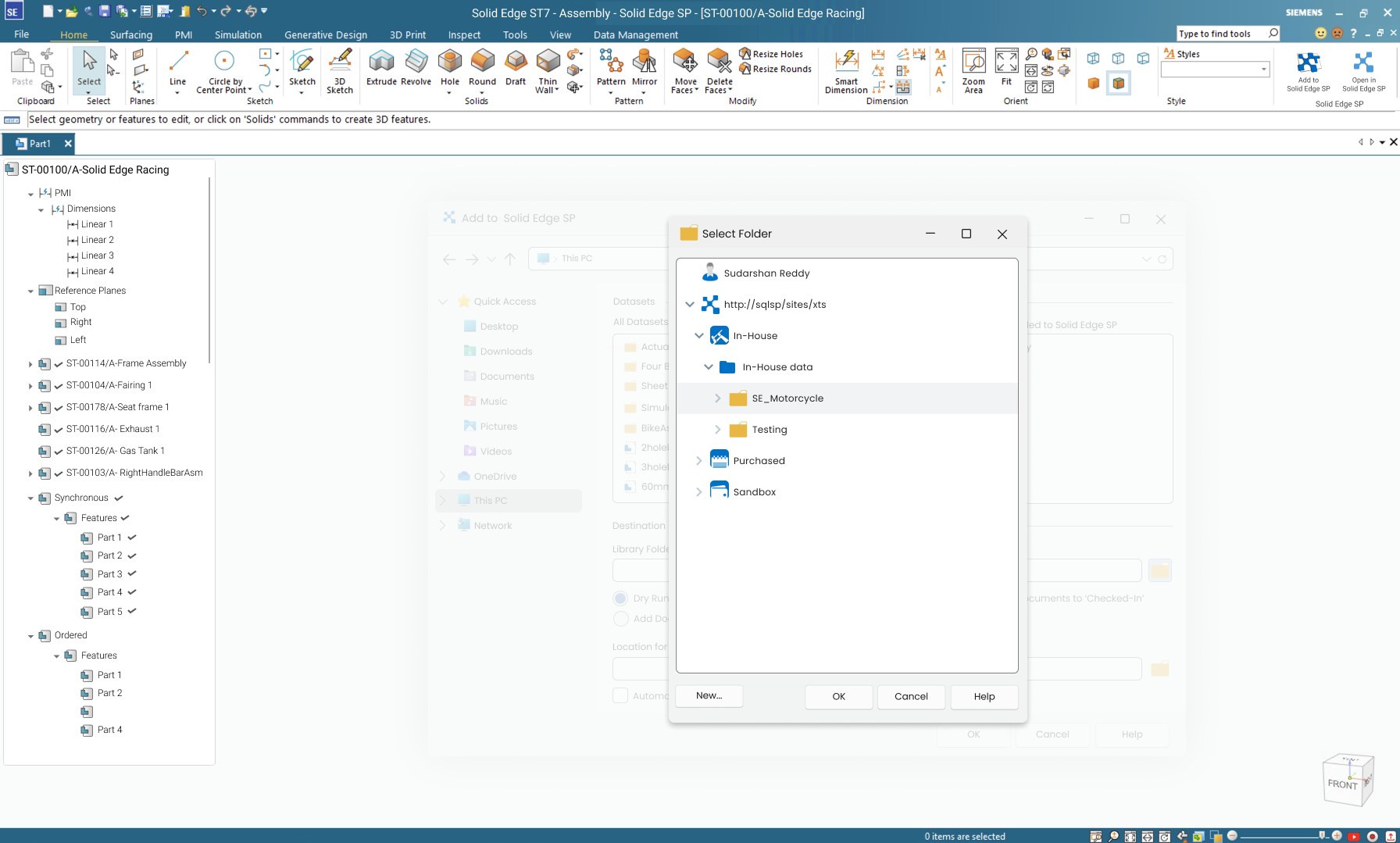
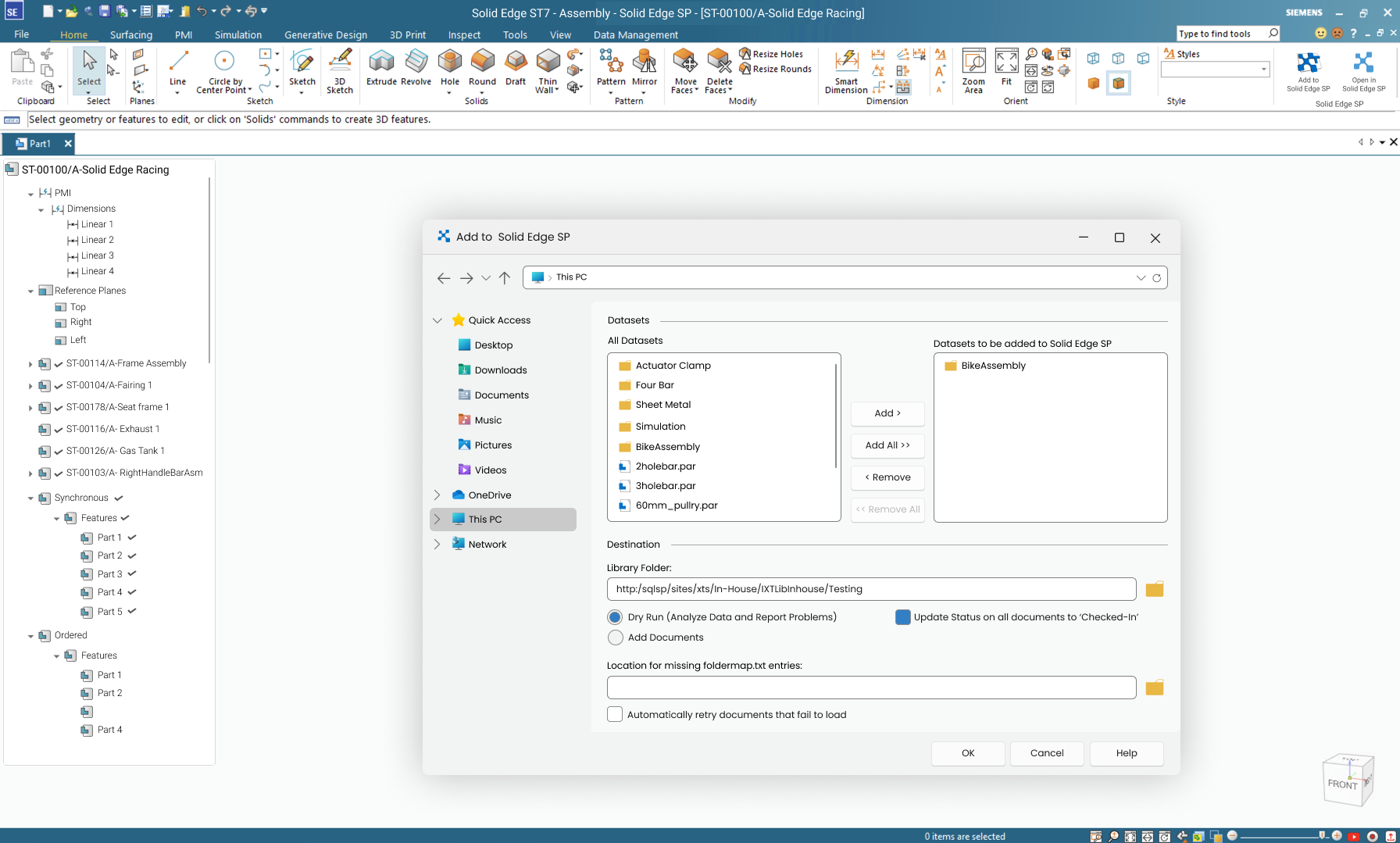
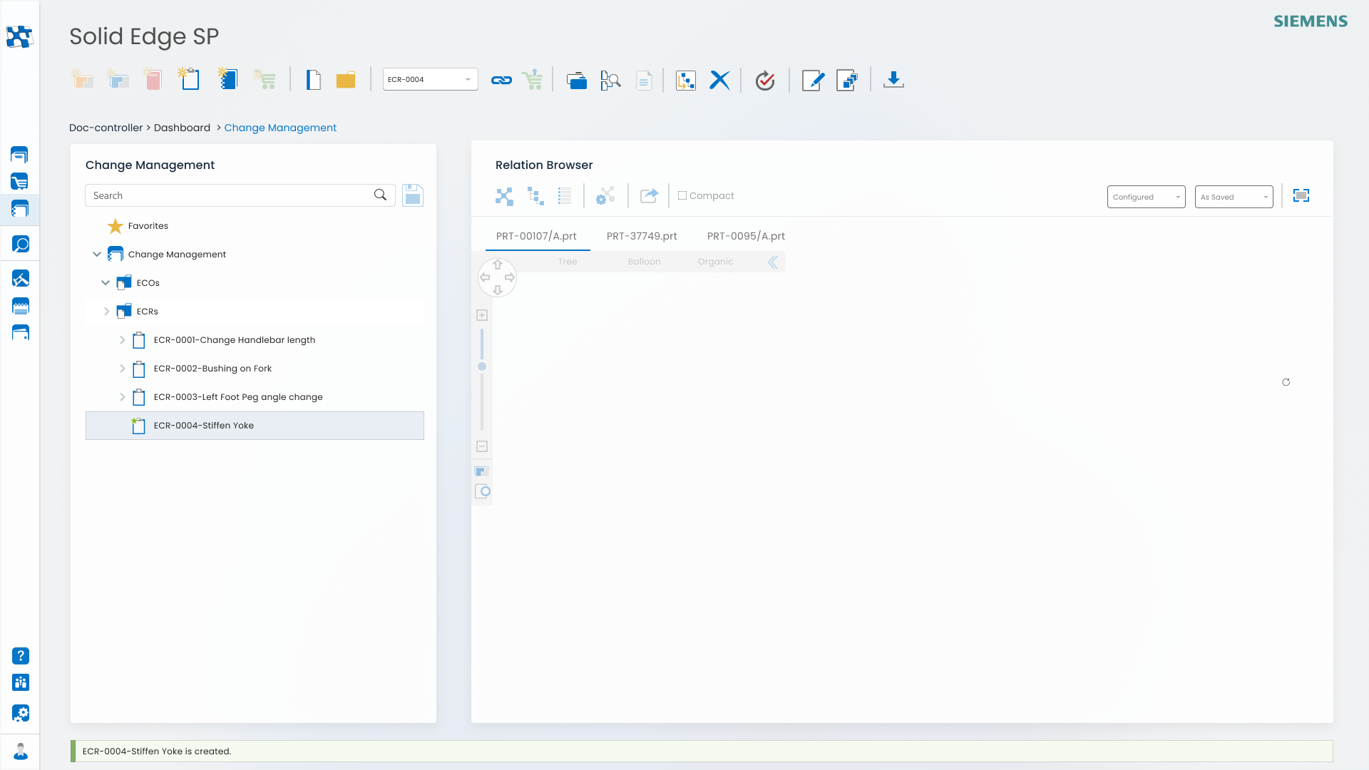
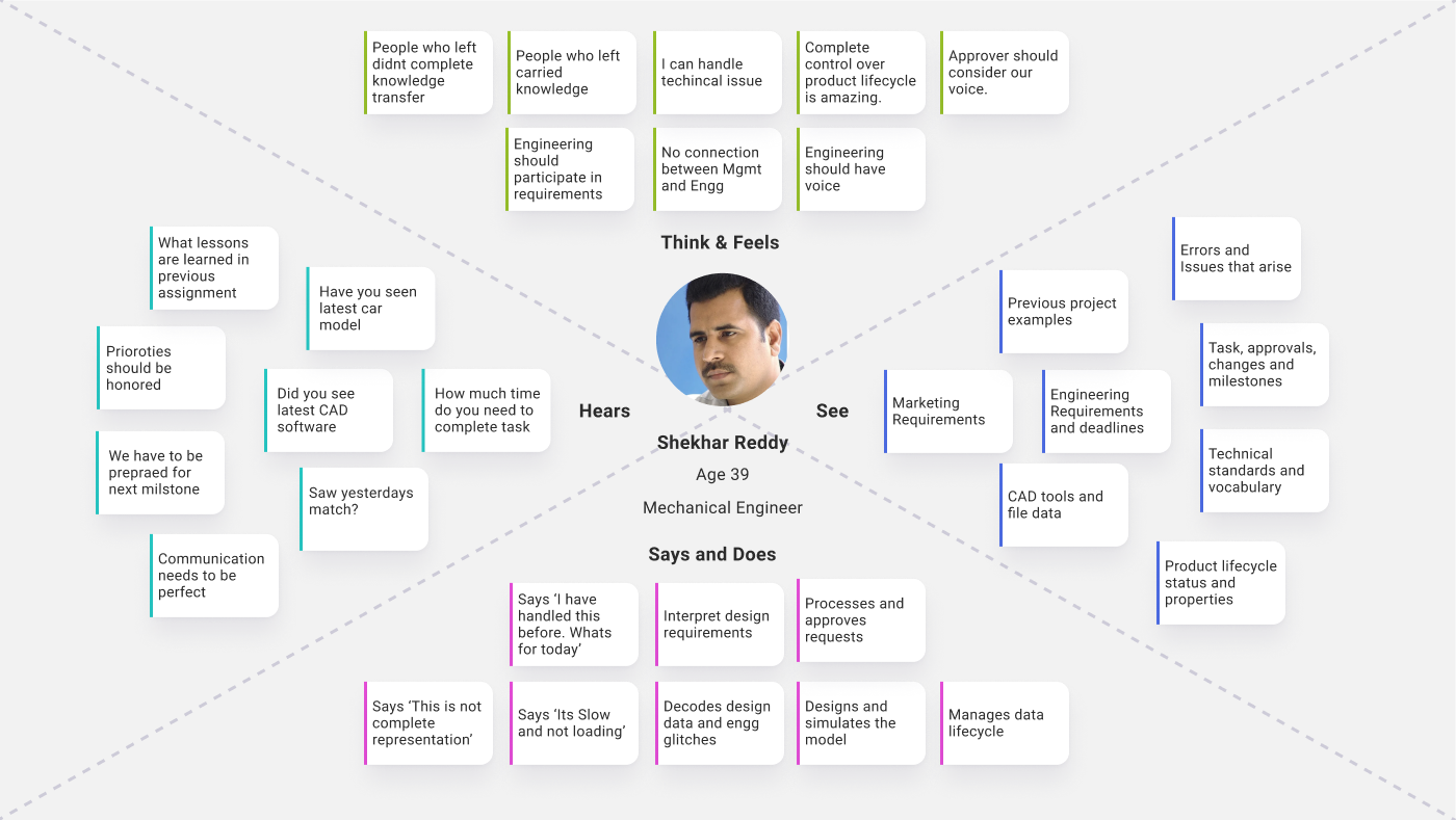
Complex PDM functionalities required discussion with stakeholders for understanding and then working on graphic.

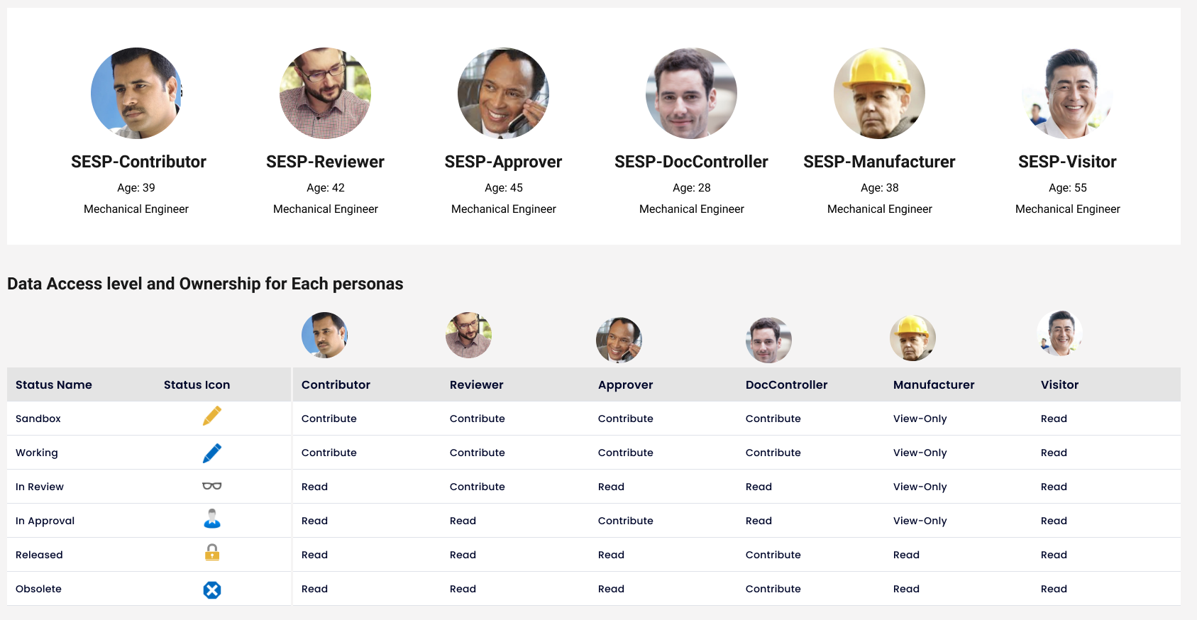
Ethonography
It was important to understand the commands from Mechanical Engineers perspective

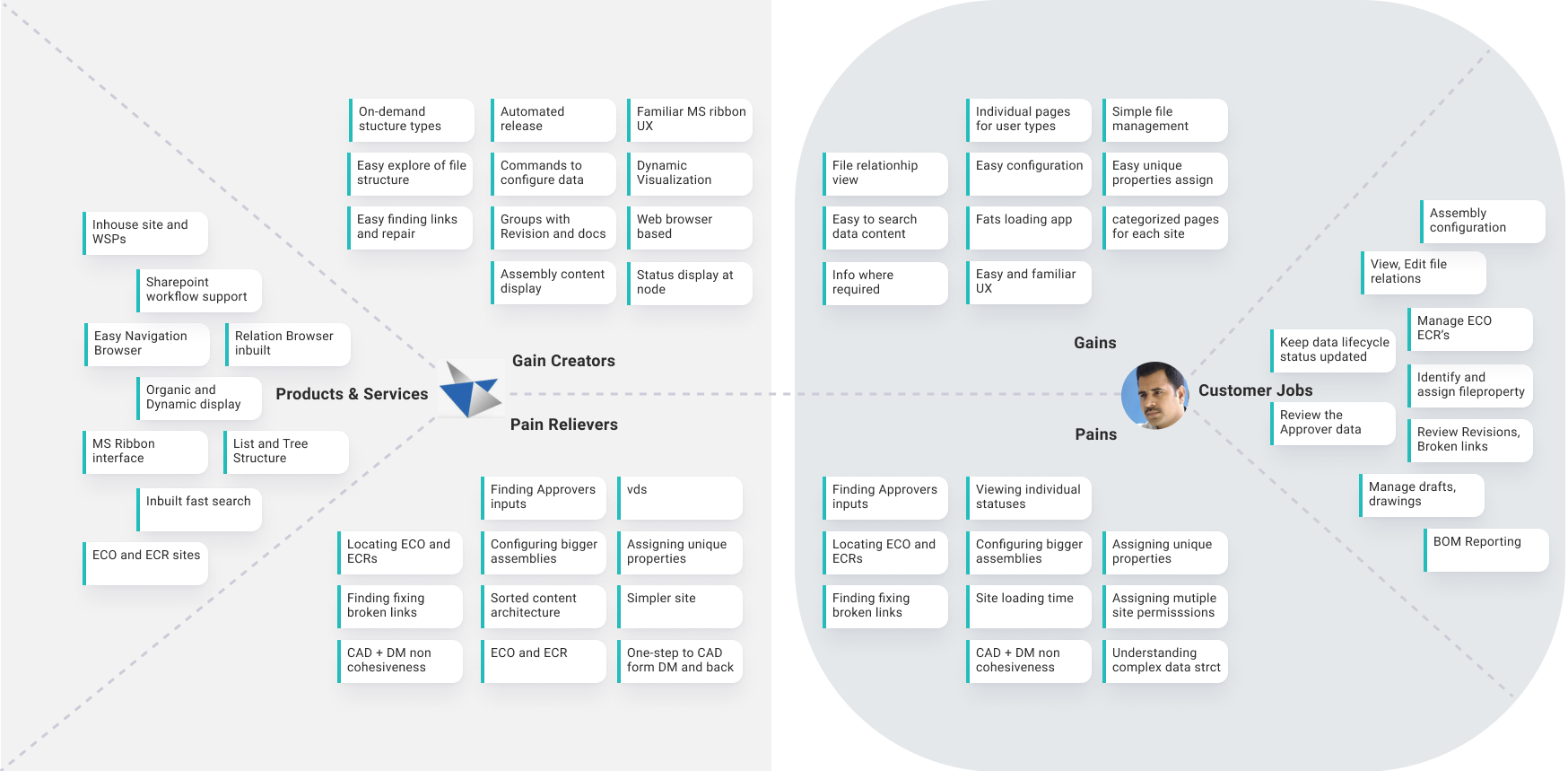
Finding the Metaphor
Metaphors really help to sort otherwise complex PDM fuctionalities.

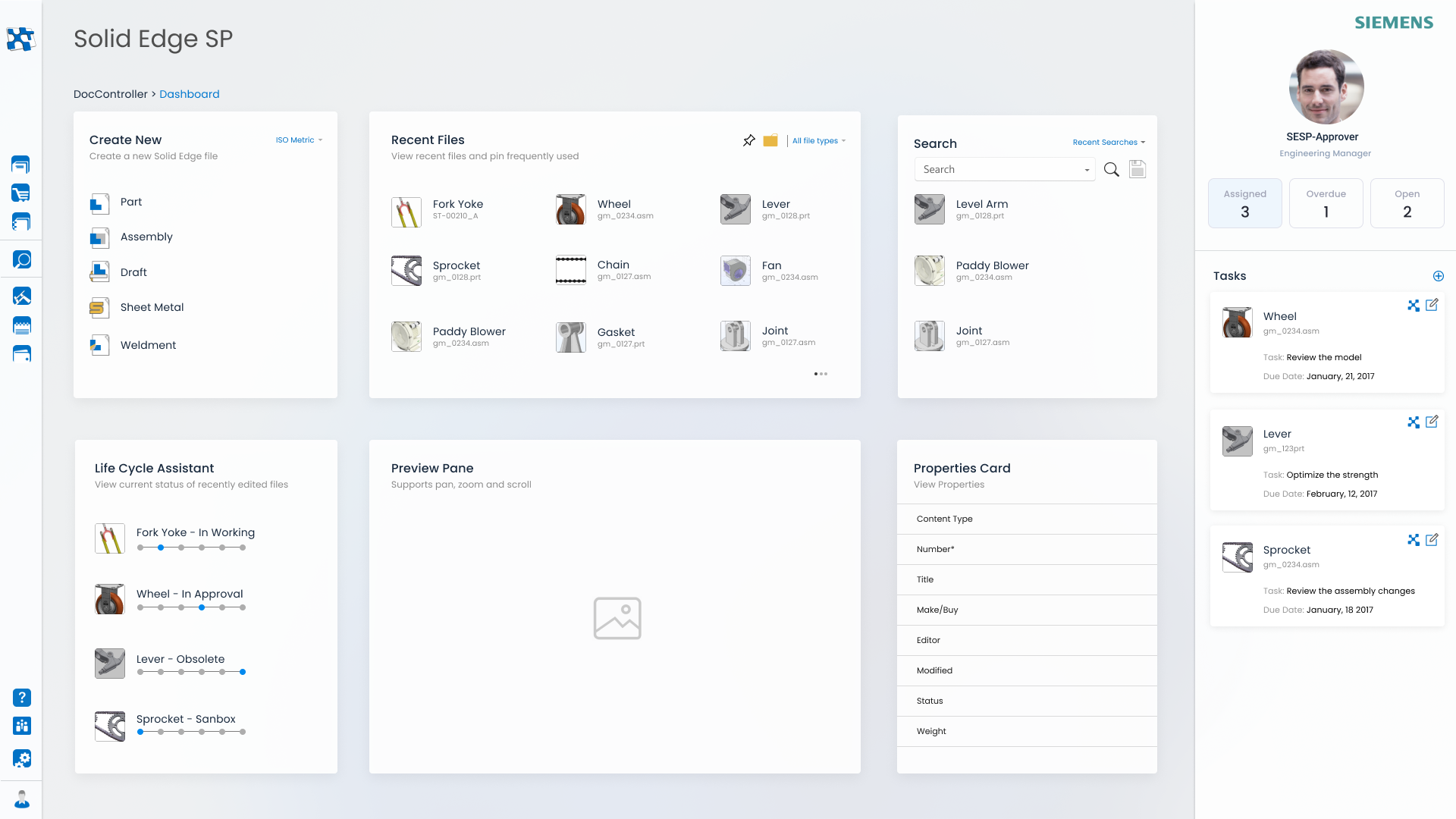
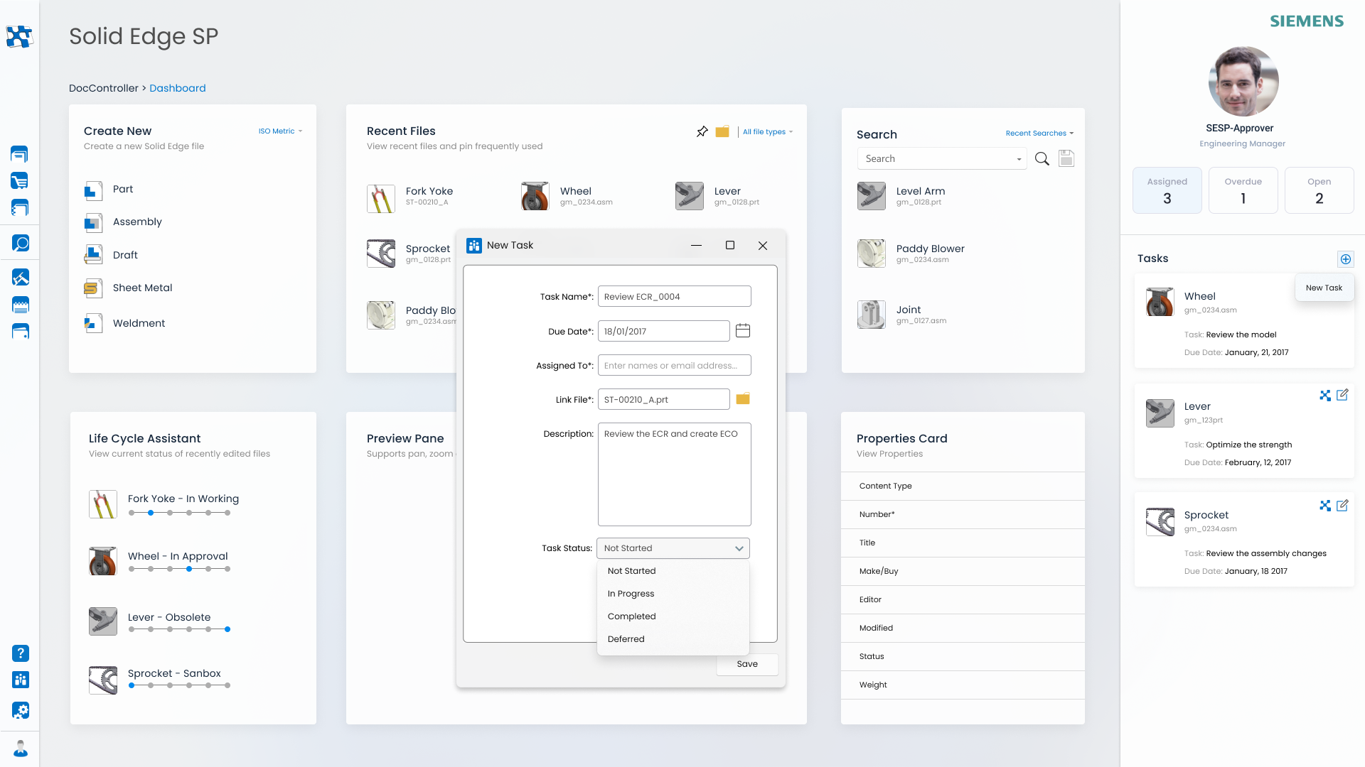
Recognition by Recall
This was about understanding experience about known software like Windows and create the icons accordingly.


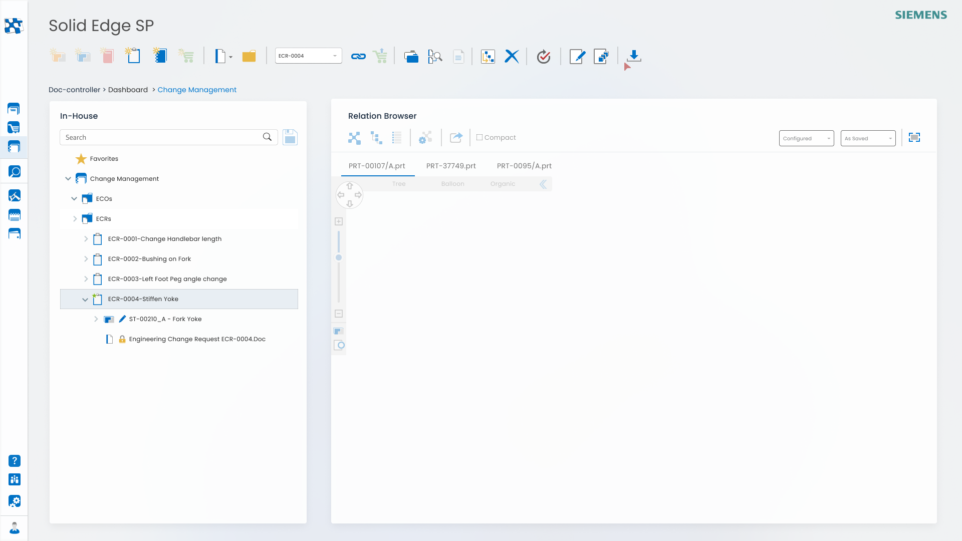
Progressive Disclosure
Complex PDM functionalities are made simpler to use by using methods like Progressive Disclosure and Omni-Channel UX.

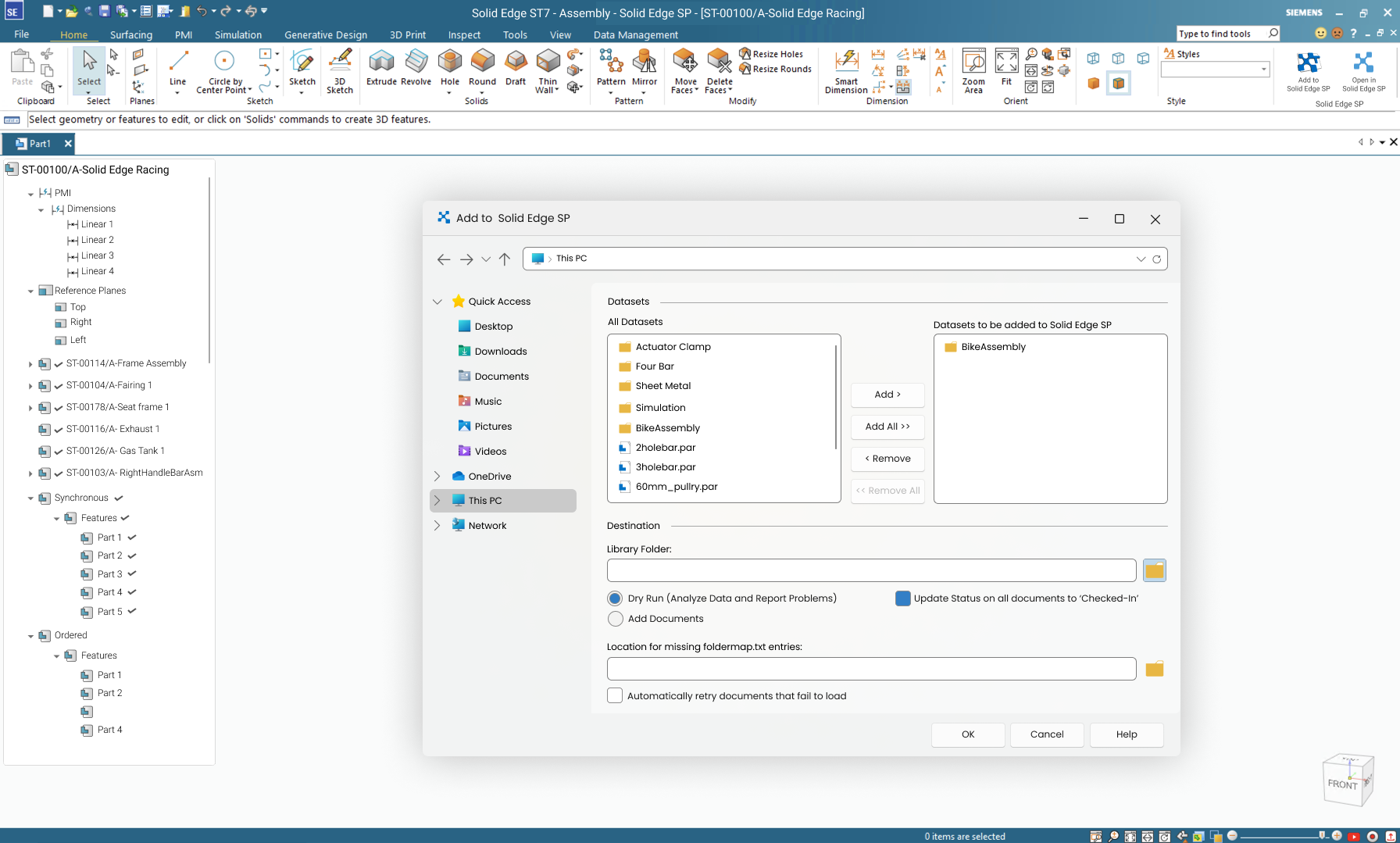
Lesser Server Calls
Downloading, storing, sharing and retrieving data takes up energy. Thus workflows, interactions were designed to reduce sever calls and thus reducing data consumption.

Sustainable Design
Findability: Web page is focussed on making the content as accessible and easy to locate as possible.
Performance optimization: Lighter controls, minimal UI, non-graphic heavy makes webpages faster to run.

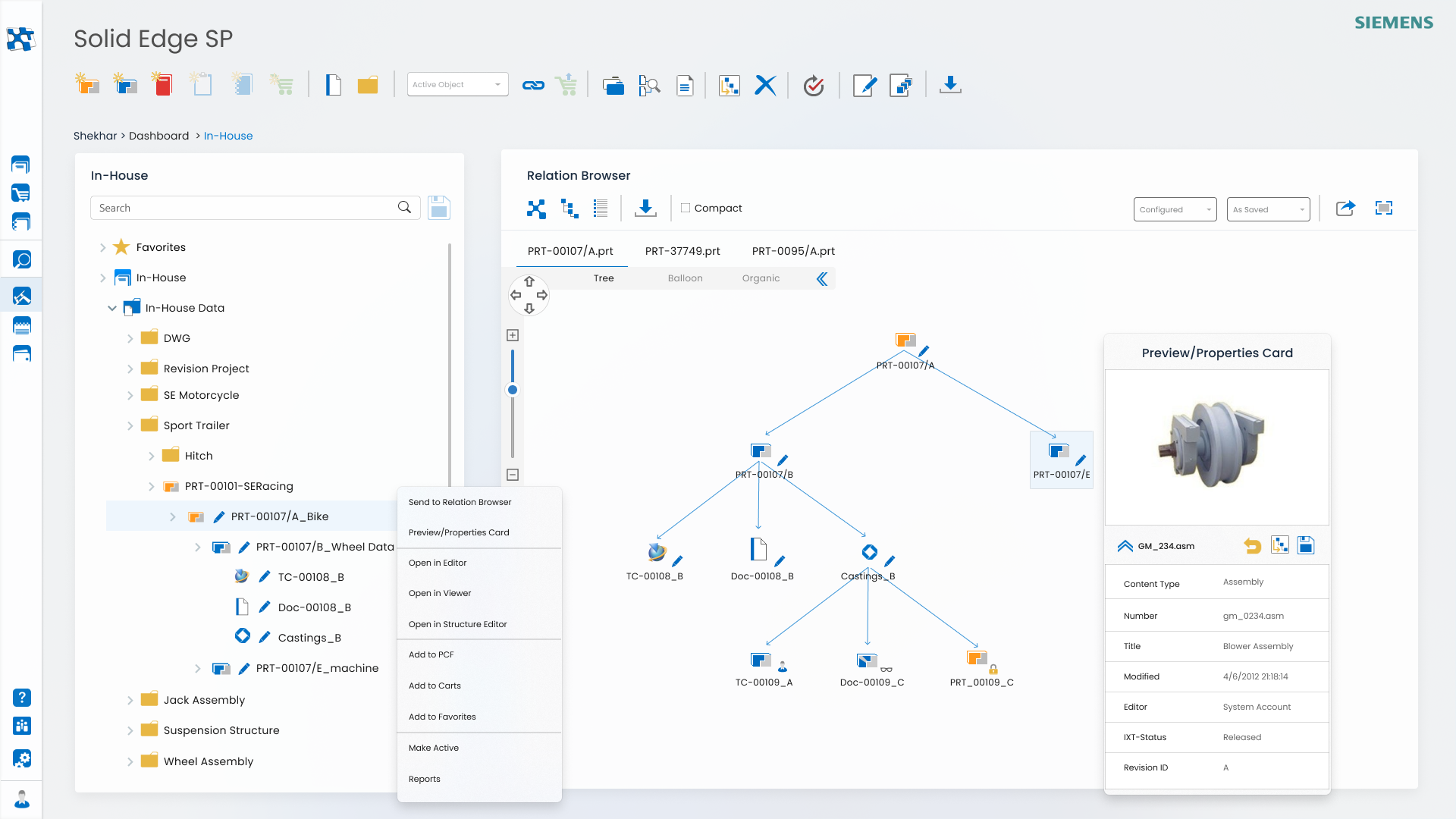
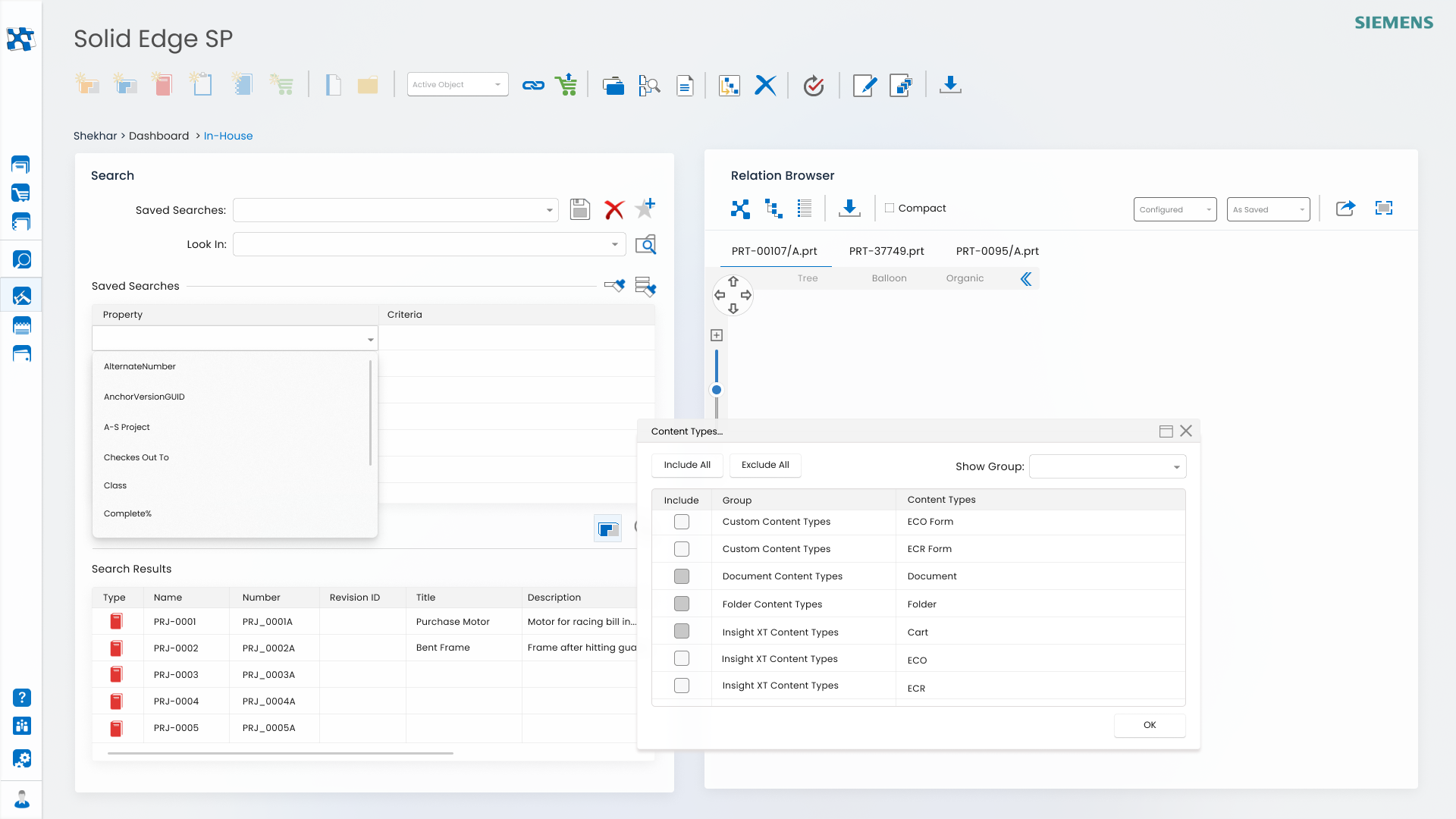
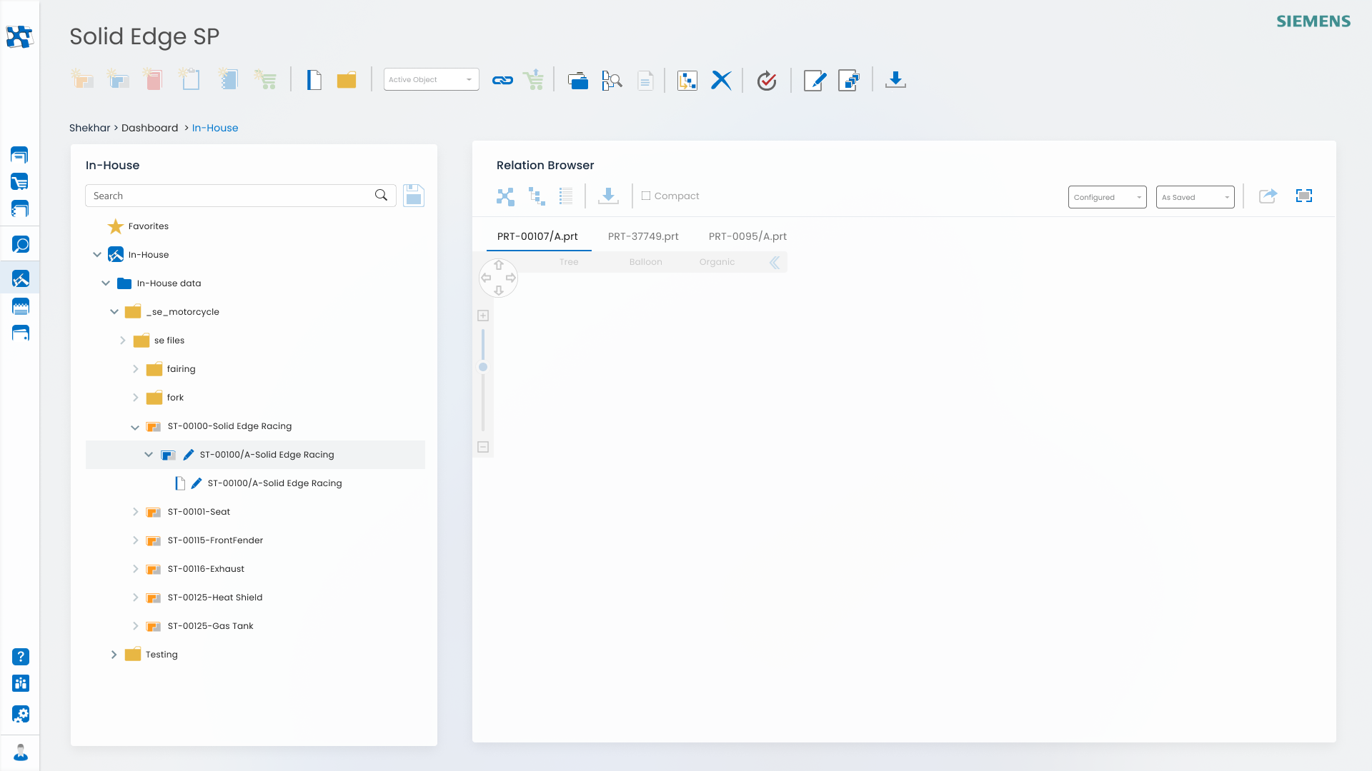
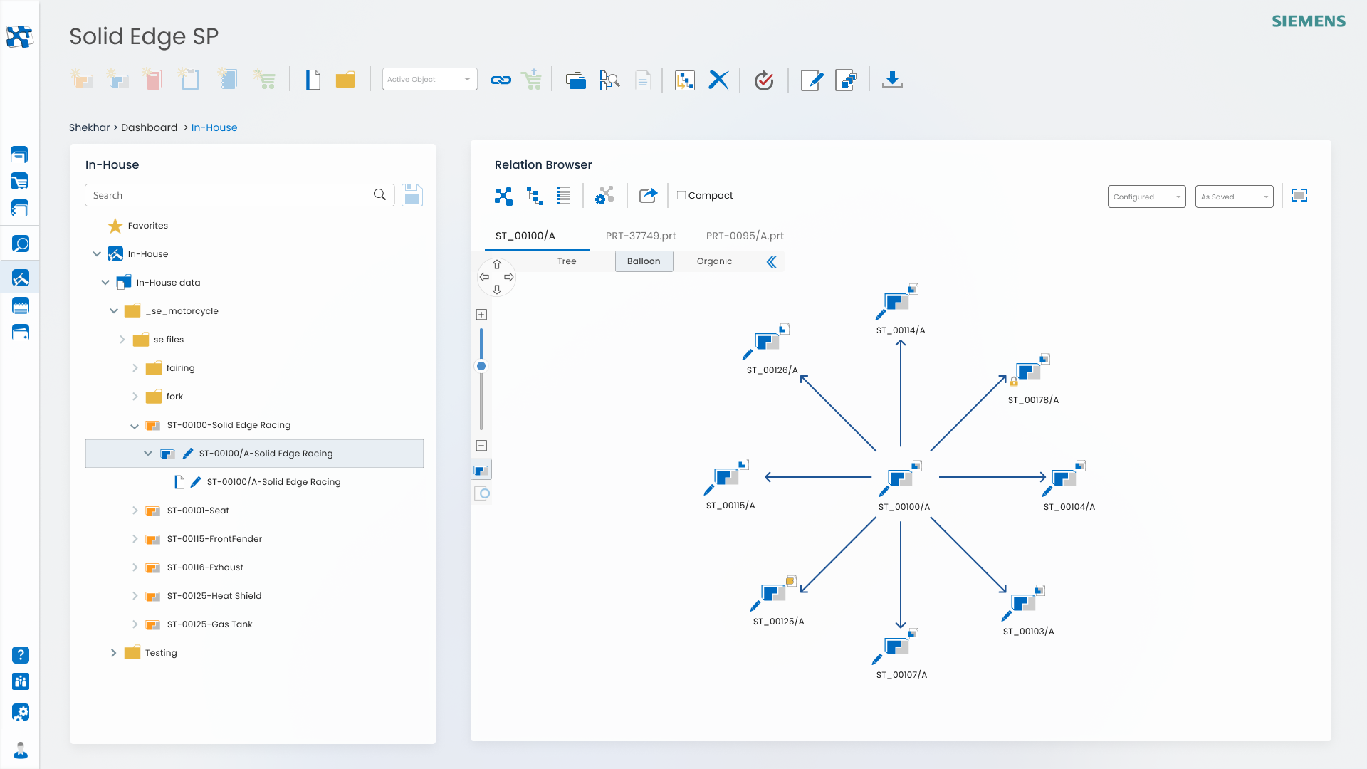
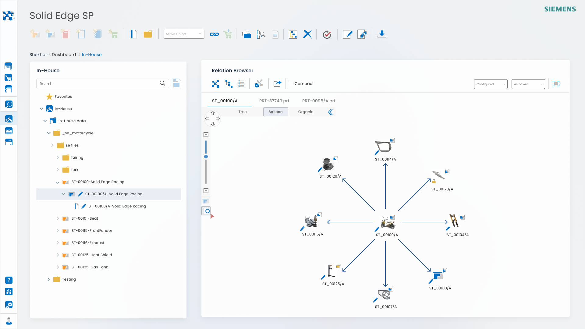
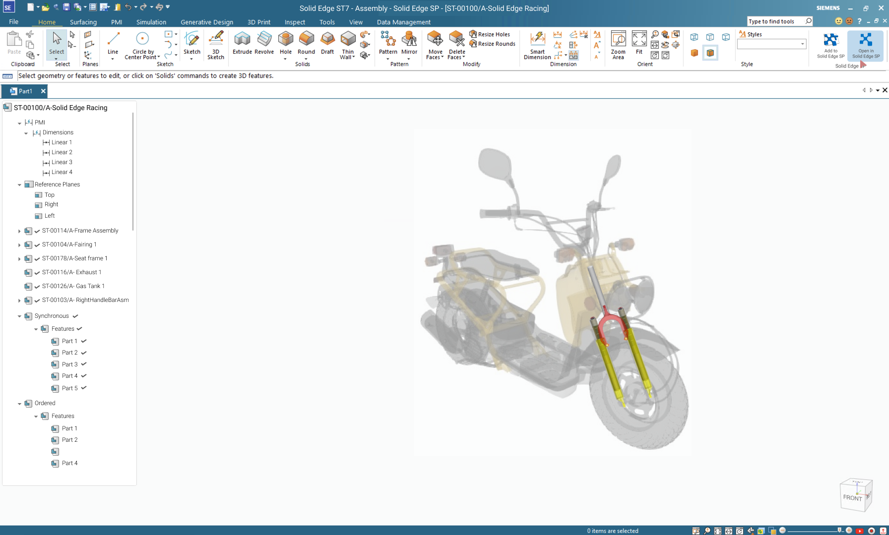
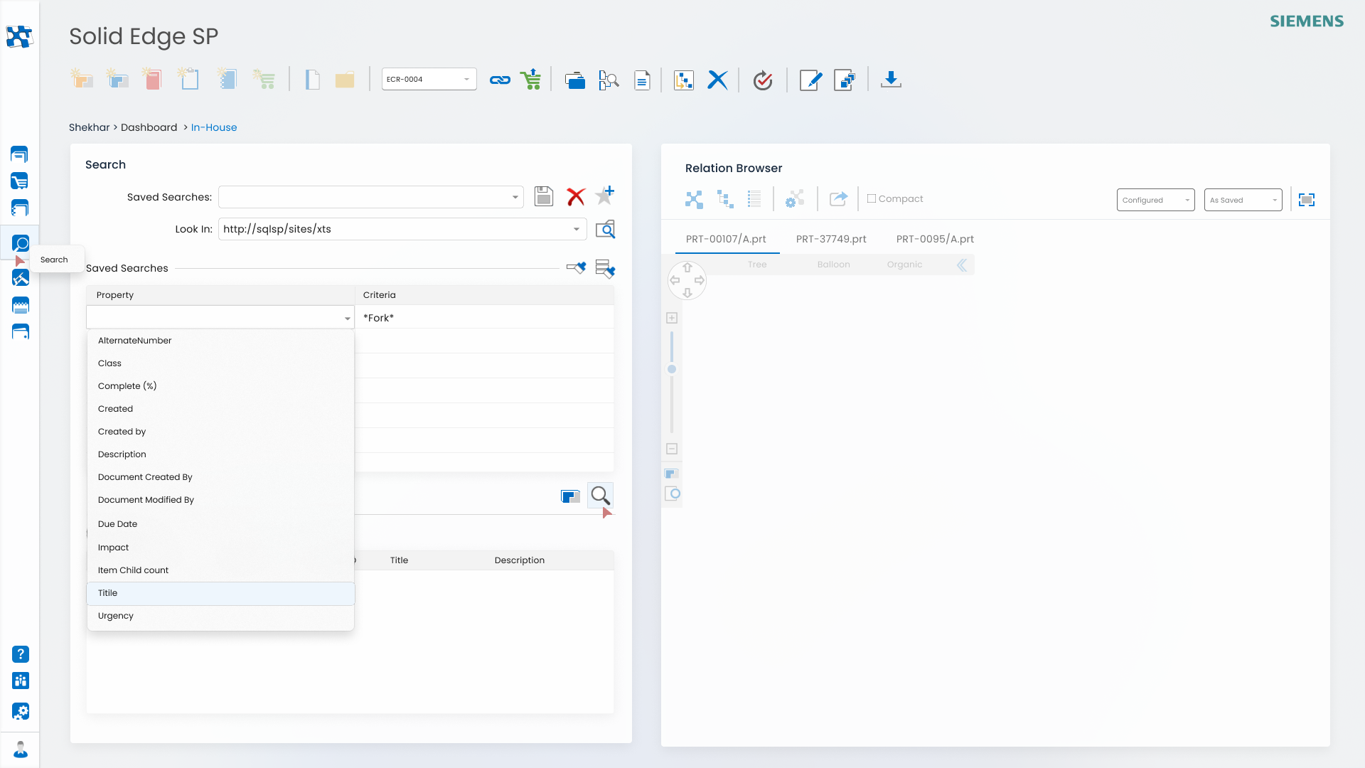
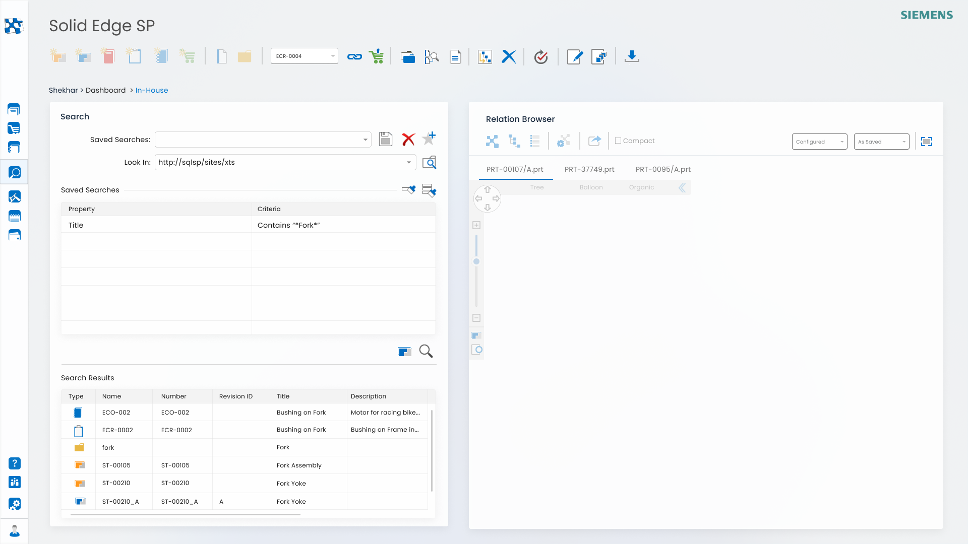
Information Architecture
For Data Management and SE CAD application(s) it is very crucial to structure and organize information to make it easily navigable for the user.

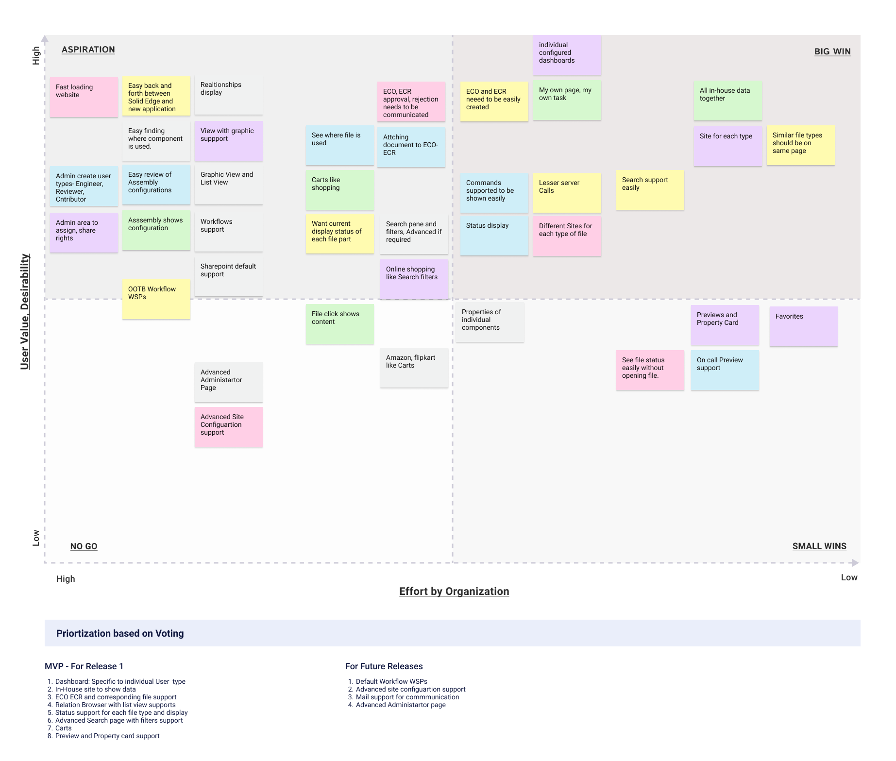
80/20 Rule
Generally 80% of user time is spent on 20% of Features. Thus the most frequently used commands, features formed main ribbon and menu(s). The secondary ones were included in drop down(s), sub menu(s).

User Engagement
Fast loading pages helped in user engagement. At locations that took time, enough status messages were thrown in to keep user aware.
Recognition by Recall helped in making user feeling familiar with otherwise difficult workflows.

MVP
My last decade years experience of software products help me to understand how to follow Minimum Viable Product (MVP) method to develop UX+UI in iterative way with each passing release.

Localization
Helped localization teams across globe on getting the UI localized. Weighing impacts of requested last minute UI changes on product stability, localization and approving/rejecting the same at extreme end of development cycle.