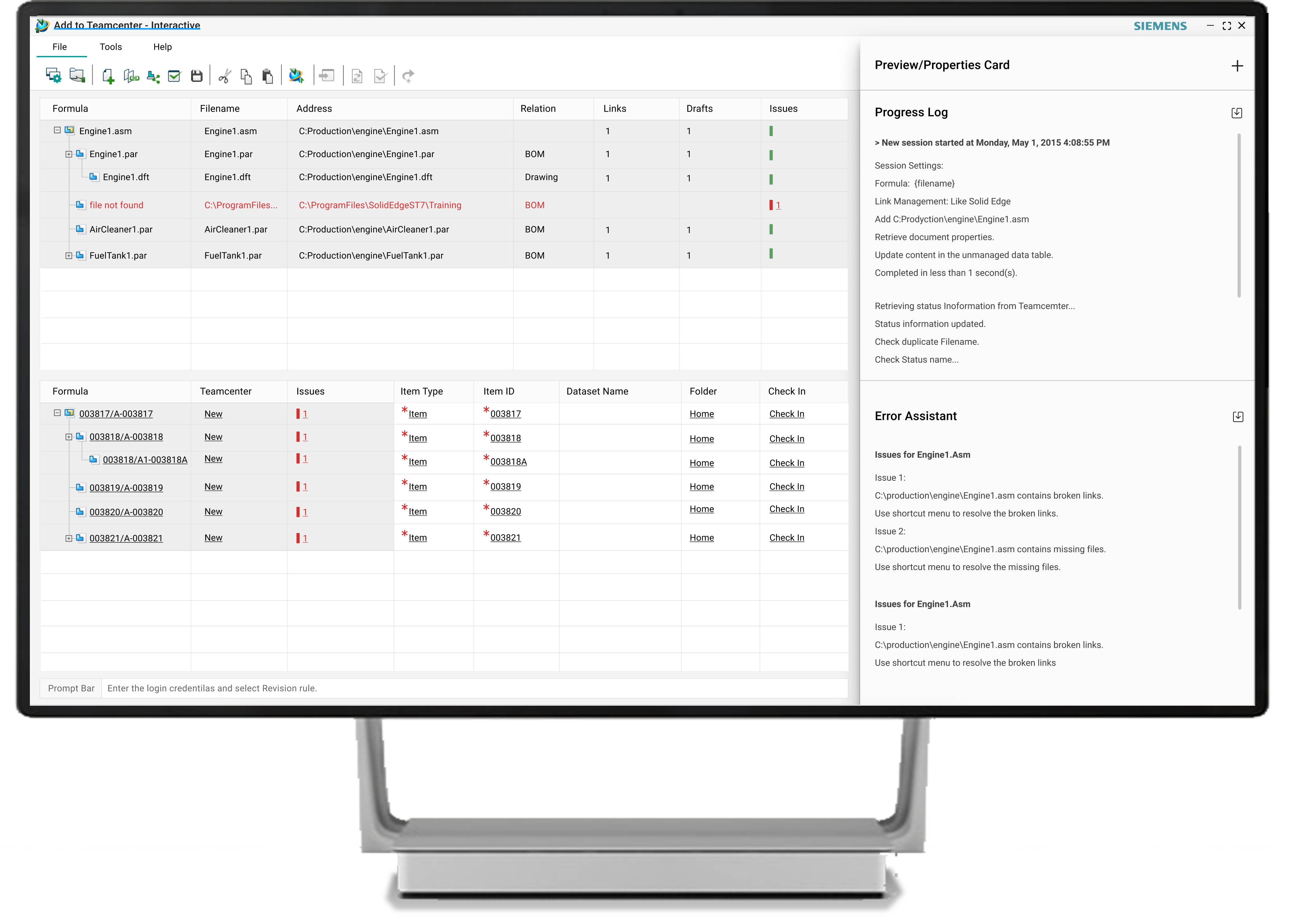
Add to Teamcenter Interactive
Add to Teamcenter is an application for bulk import in getting existing Solid Edge data into Teamcenter. This tool provides user an interactive process for adding Solid Edge 3D and draft data to Teamcenter.
With a focus on working with unmanaged data that is of a product or project in size, it is particularly suited for supply chain collaboration and reintegration of formerly managed content into Teamcenter. Data validation and error checking are combined into an interactive user interface to assist user.
2+
Years of Development
9
Developers
1
UX Designer
2017
Year of Release
Scope of my work
Stakeholder Interviews
Interviewing internal stakeholders to gather insights about business goals.
User Interviews
Questionnaire was prepared and meeting was set with user to understand qualitative data such as their needs, wants and behavior.
Competitive Research
To understand industry standards and best practices.
User Personas
Fictional characters that represent the different user types for your product. i.e. Contributors, Administrators, Approvers, Reviewers.
Empathy Map
A collaborative visualization was created to articulate what we know about particular ‘user type’. This helped to create a shared understanding of user needs, and aid in decision making.
Value Proposition Mapping
Visual Map was created to represent wants, needs and fears of our user and figuring out, how the new product or service answers them. This framework ensured that there is a fit between the product and market.
UX User Stories
With structure: “As a [user] I want to [goal to achieve] so that [motivation].”
Problem Statement
How might we create a Microsoft Sharepoint based application that helps in easy vaulting of complex design data through Visual Approach.
Low Fidelity Prototyping
Low-fidelity paper sketches of the product possibilities were created using think out loud protocol.
Brainstorming Ideas
Session was kept informal and worked well as participants were allowed with out of box ideas. This generated both practical and impractical ideas.
Affinity Map
These diagrams helped to organize information into groups of similar items and to generate qualitative data or observations.
Priortization Matrix
Simple prioritization method was used i.e. “effort vs. impact” matrix, alternatively known as “value vs. complexity”. Then it was divided into four areas, i.e. Aspiration, Big Win, Small Win and No Go.
User Journey Map
How do user actually use our application and the functionalities?’ formed the basis of user Journey Map.
Information Architecture
Information Architecture IA to define site content, hierarchy and functionality.
Navigation Model
Map included collection of user interface components and patterns that helps visitors find information and functionality.
Sketching
Drawing by hand on a piece of paper, on a whiteboard. And brainstorming sessions.
Wireframes and Testing
To visualize the basic structure of a pane, basic structure and visual hierarchy.
Prototype and Testing
Actual interaction experience (the look and feel with low-fidelity (clickable wireframes) to high-fidelity (coded prototypes).
Graphic and Imagery creation
Icons, Splash Screens creation. Checking in to TFS with Visual studio.
Dialogs
Creating XAML dialogs, side panes in Visual Studio(and Blend) and checking in to TFS.
Workflows WSP Creation
Default Sharepoint user workflows were created and corresponding WSP(s) were checked in.
Testing Sessions
Including moderated/unmoderated usability testing, beta testing, and A/B testing.
Surveys
Capturing both quantitative and qualitative information with open-ended questions like “What part of the product you dislike?”
Analytics
UIQC
Localization Testing
Testing the UI on different locales for trimming issues, display issues and key(s) checks.
UX Priorities

Lesser Server Calls
Since this is primarily desktop application, server calls are limited to only two commans i.e Teamcenter Upload and Validations.

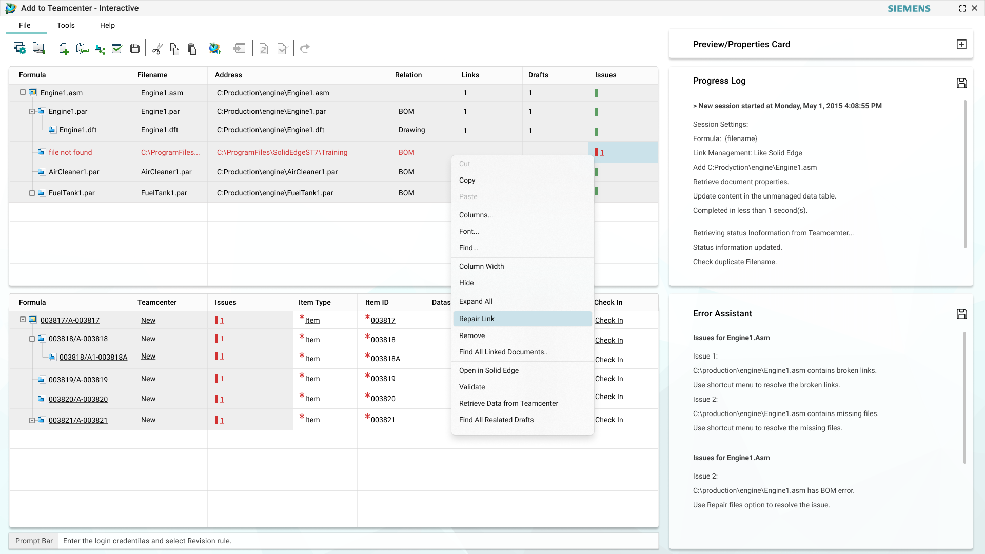
Preview and Properties; only on request
To improve performance, the Preview Properties Card is not kept ON by default. User can only view it when required. This reduces the app loading time.

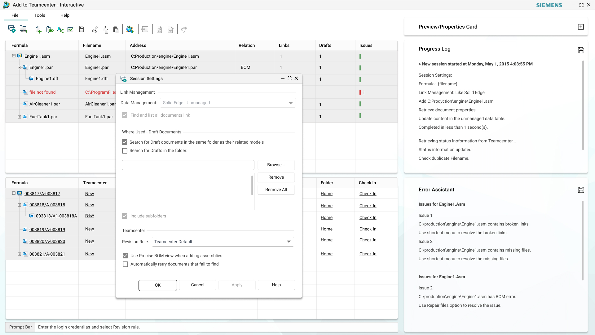
Progress Log and Error Assistant Pane
The log pane displays executed command and the workflow.
Error Assistant higlights the error and corrective actions.

Prompt Bar guidance
Prompt bar at the bottom is included, to guide through the individual command.

Dialogs
All the dialogs were reworked and simplified to add required functionalities simplifying workflows
Screen 1- Startup Screen
Existing Structure Editor had limited functionalities to deal with managed files only from Solid Edge. The UI was old, where workflows neither supported advanced functionalities nor were they easy.
Existing start-up screen had unnecessary components, with no login page and obsolete help links.

Existing Startup Screen

New Startup Screen UX
In the new startup screen, managed login using Teamcenter was included. This helped user to start moving the managed data to Teamcenter on the application directly.. Option was also added to enable login using organisation credentials for our enterprise users. User can also start a session using the unmanaged documents and then add data to Teamcenter using the session settings and Teamcenter login.
Screen 2: Application Screen
Structure Editor had preview window in main pane, which lead to performance issues due loading of CAD graphic on every launch instance..
Overall look and feel was rather old with older imagery, limited functionalities and more importantly absence of display of progress of each command, running sessions and errors.

Existing application layout

New Application Screen UX

New UI Components Design
In new UX, the log pane displays the executed command and its workflow. Error Assistant highlights the error and corrective actions. Prompt bar at the bottom is included, to guide through the individual command. All the dialog workflows are detailed out, so that engineer can interact between SEList Ctrl, Commands and the dialog UI efficiently.